News:Version 544 with new graphical profile!
| Published | 2012-09-18 |
|---|---|
| Module | /General |
| Version | unknown |
| Revision | 23254 |
| Case number | unknown |
| News link | 2506 |
In the new graphical profile of Marathon the idea is that the part you are working with shall be highlighted and focused on. For this reason we have been cleaning away things that can interfere with your concentration. The new graphical profile is still the same Marathon as before. It is still quick, powerful and logical.
In the new version we have mainly changed the look of the Start page. It is only here and in Marathon Time that we have been moving functions. In the functions the only thing that has changed is the graphical look. All other functions are unchanged, as fields, boxes, columns, etc.
The first time you log in to Marathon version 544 you will get a notification and possibility to link to this page.
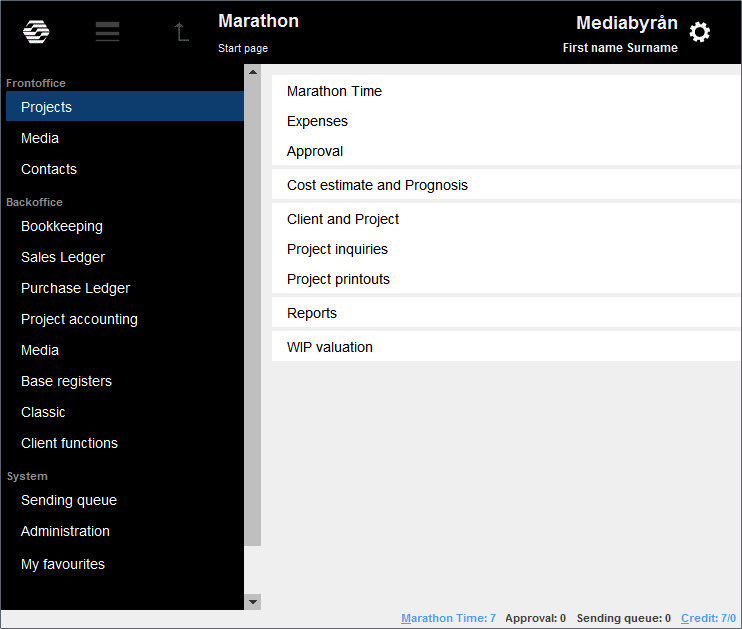
The new graphical profile looks like this:
| Explanations |
|---|
![]() has replaced the text Start page. When you click on the Kalin Setterberg logotype, you will move to the start page.
has replaced the text Start page. When you click on the Kalin Setterberg logotype, you will move to the start page.
![]() This symbol has replaced the Marathon runner that looked like this:
This symbol has replaced the Marathon runner that looked like this: ![]() . By clicking the symbol, or using the Alt key + arrow down, you will reach the functions you have been working in since you last time started Marathon but not yet exited. When you log out from Marathon, the list will be deleted.
. By clicking the symbol, or using the Alt key + arrow down, you will reach the functions you have been working in since you last time started Marathon but not yet exited. When you log out from Marathon, the list will be deleted.
![]() works like the previous button for exiting a function.
works like the previous button for exiting a function.
 shows your current position in Marathon.
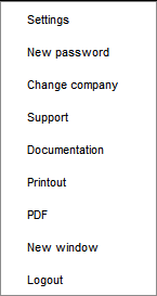
 In this area you can click to get the following functions:
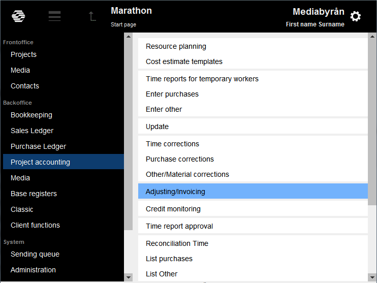
The entries to the different functions that earlier were listed on the start page have now been grouped at the left side of the screen. When you navigate between the functions you can, instead of using the mouse, use the arrow keys and Enter. In the example below arrow down was used to go from Frontoffice/Projects to Backoffice/Project accounting. To go further to Adjusting/Invoicing, use first arrow right and then arrow down.
| Marathon Time |
|---|
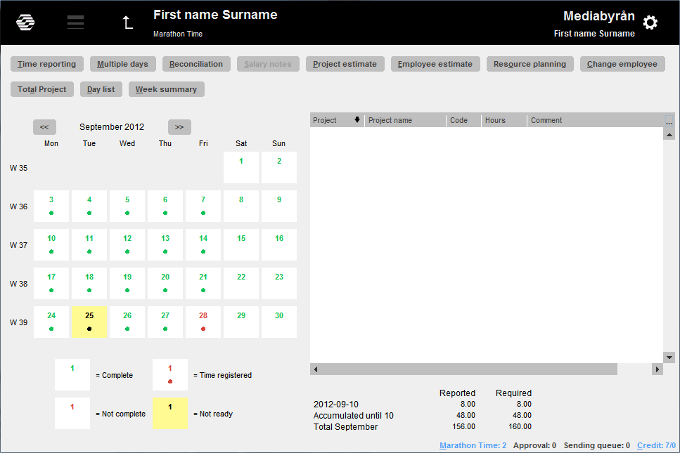
In Marathon Time, the dog’s ear marking registered time on a day has been replaced by a dot under the date. Reported and not reported days no longer has green and red backgrounds; it is only the date that is shown in the colour. Days that are marked “not ready” are still shown with yellow background.
The function Multiple days has been moved and is now found together with all other functions above the image.
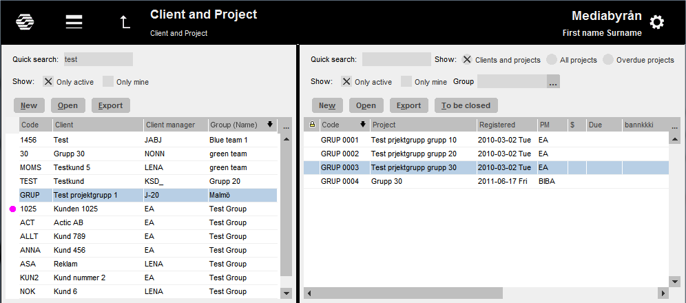
This is the look of Client and project with the new graphical profile.
Tables and lists have become more clear as the row that you mark is highlighted with light blue colour.
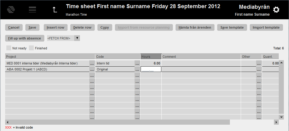
Input fields are now more explicit, see example from Marathon Time below:
The field that has the cursor is shown with white background and not with light grey like the other fields.
