News:Introduction to Marathon 546
| Published | 2015-09-30 |
|---|---|
| Module | Project, Media, Accounting, System |
| Version | 546 |
| Revision | 31255 |
| Case number | 832931 |
We are continuously developing Marathon to make it better. This time we have enhanced the interface so that working in Marathon will be easier.
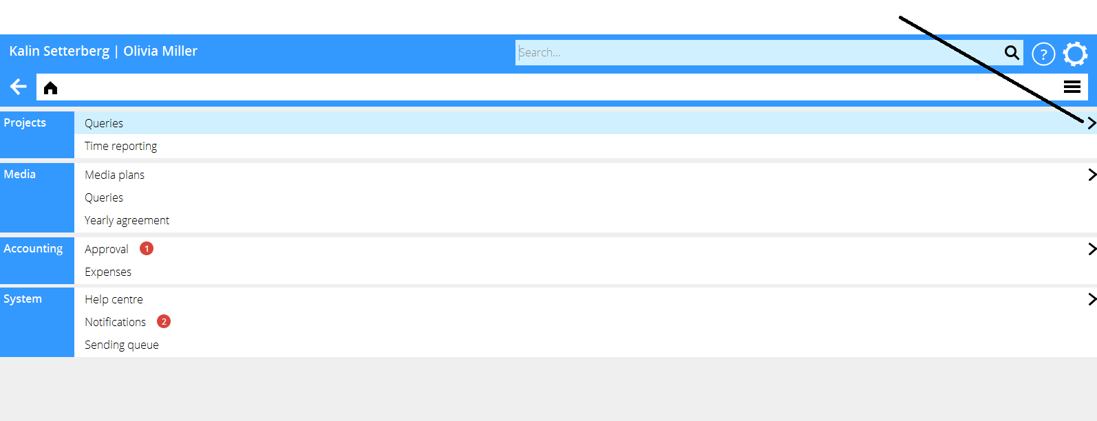
We have been hiding functions and buttons that are rarely used. We have merged functions and buttons that are similar. Thus you don't have to see things that you seldom or never use. You can find the hidden functions and buttons by clicking the symbol >. You can also pick up hidden functions to be visible again.
We have also made changes in the appearance that make Marathon easier to perceive. We use bigger font size, we have removed unnecessary lines, we have increased the contrast and we use more colour.
Contents
Main bar
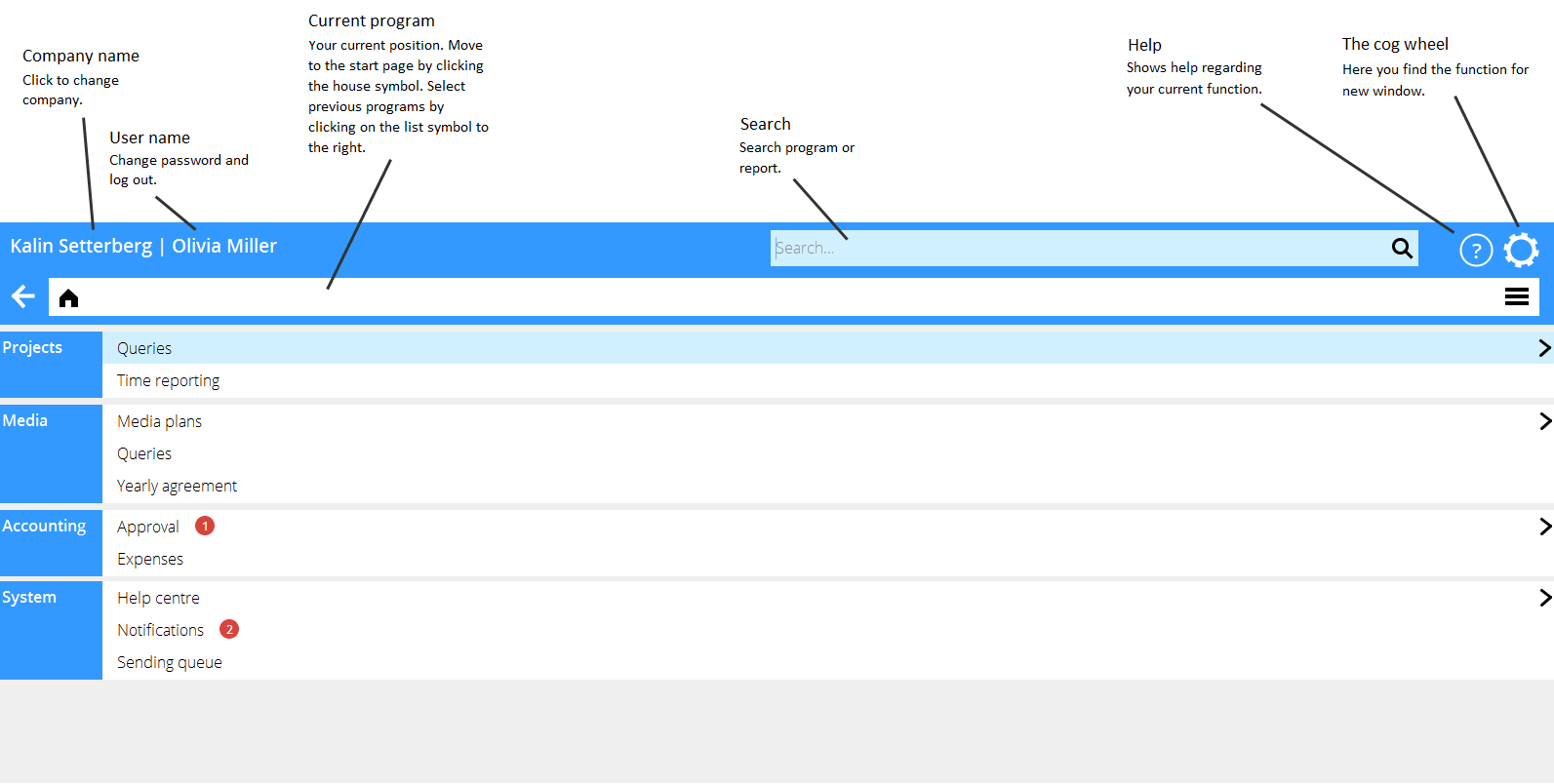
The bar on the top of the screen is visible in all programs in the system. It contains everything that it used to before, but with some new placements. New functions are the search field and the Help button.
The start page
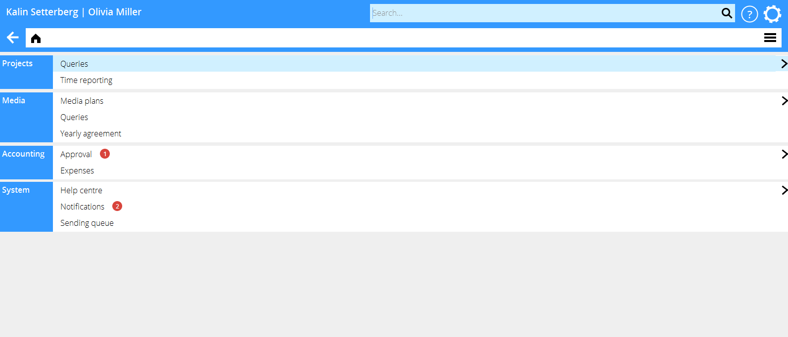
The start page, that earlier had the program menu on the left and the submenues at the right is now replaced with a simple list of functions. You decide what functions to see and hide. The list will be simpler and you can see functions from all parts of the system. All functions are always available under the > symbol.
We no longer make a distinction between Frontoffice and Backoffice. We have had some problems in deciding what category a certain function belongs to. We have also now merged a backoffice function with a frontoffice function in order to reduce the number of functions; this also makes it impossible to decide on what side the merged function should be placed.
Badges
The old interface had a status bar at the bottom of the screen. It showed number of unfinished time reports, unapproved invoices, documents in the sending queue and unread notifications.
In the new interface this information is instead shown with red badges on the start page. Below an example of one invoice that has not been approved and two notifications that are waiting to be handled.
Merged functions and buttons
Through merges we have reduced the number of functions on the start page from 94 to 52. This makes it easier to find the right function on the start page. The further deepening is done in the next step, often by choosing between different tabs.
As an example, we have merged the Preliminary entering and the Watch list. The function on the start page is Suppliers' invoices. The function has tabs for Preliminary entering and Watch list. Many standard reports have been moved to the Reports function. There you will find them together with your own reports.
News:Merged_functions_and_buttons
Hidden functions, buttons and filters
By hiding functions, buttons and filters that are rarely used, we have reduced the number of choices that you as user have to face. we have not been counting, but appreciate that we now are showing 25% of all the functions, buttons and filters shown in the old version.
The hidden functions are found when you click the symbol >. You see all hidden functions in a list and you can choose one directly, but you can also select it by clicking the dot preceding it and thus it will not be hidden anymore.
The search function
There is a new search field on the top of the screen that always is available. There you can search for functions and tabs, even if they are hidden.
In the future we will extend the search function so that you can search e.g. account numbers or clients.
Changes in the appearance
We have made some changes to the appearance of the system so that Marathon is airier, lighter and simpler. That makes perception easier and quicker.
We use a bigger and airier font and we have increased the contrast between fore- and background.
We have removed many unnecessary lines and details. We are using slightly more colour, but still mainly to catch the user's attention.
A new feature in 546 is that all tables can be adjusted so that they can be shown in other sizes than in the rest of Marathon. You can also select supporting lines to the tables.
Help button and Help centre
With an extended help function, getting help will be easier and quicker. In the upper left corner there is a help button showing help concerning the function that you currently are in.
There you can find frequently asked questions, where we have gathered the most common question regarding the function.
Thereafter you will see references to the manual or manuals that describes the function.
The third part shows the latest news in the function.
Finally you will see how to contact our support team and our consultant's team. Use the support function if you have questions about how the system works or if something is not working the way it should. Use the consultancy function if you want our consultants to help you with something in the system, e.g. a new report or training in a certain function. The consultants always present the price before they start to work on your case.
In the new function Help centre you can search on FAQ's, manuals and news throughout the system.
Removed functions in Classic
Just as before, we continue removing some functions from Classic; some that no longer are in use and some with full equivalents in the new interface.


